
15 Hair Salon Website Design Examples for Inspiration
Your website is often the first impression potential clients have of your salon, and the right design can turn browsers into booked appointments. These 15 hair salon website design examples showcase what works in 2026: prominent booking buttons, stunning photography, mobile-friendly layouts, and clear service menus that make scheduling effortless. Whether you're building from scratch or refreshing an existing site, you'll find actionable inspiration to create a website that reflects your brand and keeps your chairs full.
Browse 15 hair salon website design examples, plus a 4-step plan to build a mobile-first site with a booking button that converts.

Key takeaways
- The best hair salon websites combine stunning visuals, easy navigation, and seamless online booking to convert visitors into clients
- Mobile responsiveness is non-negotiable — most clients search for salons on their phones, and a clunky mobile experience means lost bookings
- A prominent booking button and clear service menu with pricing are the two highest-converting elements on any salon website
- You can build a professional salon website in minutes with the right platform — no design experience required
As a hair salon owner, you have a lot on your plate. Maybe you're just getting started, you have a tiny budget, and you're super busy — so building a website might seem less important compared to the day-to-day operations of your business. However, hair salon websites are a critical component of getting people through your doors and into your salon chairs.
Try GlossGenius free for 14 days!
Having one makes you appear more professional, helps you attract local business, and gives you a chance to showcase your best work. Plus, today's technologies have made it easier than ever to build a website in a matter of minutes, without hiring a costly web design agency.
To help inspire you to create a website of your own, we've put together our picks for the 15 best hair salon website design examples from around the web. But first, let's talk about what makes a great hair salon website.
What makes a great hair salon website?
A great hair salon website combines stunning visuals, intuitive navigation, and seamless online booking to convert visitors into clients. Your website should be beautiful, straightforward to navigate, and built for conversions — so you can get more people to book appointments and return in the future.
If your calendar isn't as full as it should be, your website and booking experience may be costing you appointments. On average, businesses on GlossGenius saw a 22% increase in appointments within their first year on GlossGenius.
The essentials of effective salon website design include the following:
User-friendly navigation
Potential clients should be able to quickly view testimonials, past work, and service pricing. If someone hasn't been to your salon before and found you through a local search, they'll want to know what kind of results to expect and how much it will cost.
Consider it from the perspective of the client. You want to find the information you need as quickly as possible, without getting lost in the process. The navigation should be simple.
You should always have a clear navigation bar with a booking link at the top of every page on your site, or at least have links to it clearly displayed somewhere on each page. If your clients can't find their way around easily, they'll quickly become frustrated and leave your website in favor of one that's easier to use.
Mobile responsiveness
When potential clients can't easily browse your services on their phone, they bounce—and you lose bookings. That's why your site needs to be mobile responsive, and with GlossGenius you can also create a mobile app for your salon that puts the power of your website in clients' hands.
Seamless online booking
Clients should be able to book directly on your site without needing to call. With booking software for beauty, wellness, and health businesses like GlossGenius, hair salon owners can quickly integrate appointment scheduling into their websites. GlossGenius is designed for fast booking—many clients can complete booking in under 30 seconds, without logins or app downloads.
High-quality photography and visuals
Hair salon and other beauty, wellness, and health business websites should always have high-quality photos that show off the team and products in action. You want to be sure that anyone who visits your website can see the quality of your stylists' work and the overall vibe of your salon.
Consider adding a portfolio gallery to showcase your best transformations. If they like what they see, they'll book an appointment!
Strategic color palette and branding
A well-chosen color palette can set the tone for your beauty salon and reflect the style and ambiance of your physical space. Whether you opt for a minimalist black and white scheme or a lavish salon-inspired blend of golds and creams, your color choices and background should align with your brand and appeal to your target audience.
What to look for in salon website examples
Before diving into our curated list of hair salon website examples, it helps to know what you're looking for. Use this checklist as you review each example to identify design elements you might want to incorporate into your own site:
- Booking button placement: Is it visible above the fold? Can you find it from every page?
- Service menu clarity: Are services listed with descriptions and pricing?
- Visual quality: Do the photos showcase the salon's best work and atmosphere?
- Mobile experience: Would this site be easy to navigate on a phone?
- Brand consistency: Do the colors, fonts, and imagery tell a cohesive story?
- Social proof: Are there testimonials, reviews, or before-and-after galleries?
- Contact information: Is it easy to find the salon's location, hours, and phone number?
Keep these elements in mind as you explore the examples below — and note which features resonate with your own brand vision.
15 best hair salon website examples for design inspiration
The best hair salon websites share common traits: booking-first CTAs, strong photography, and mobile-friendly designs that make booking effortless. Our selected salon website examples are below:
1. thp hair

The neutral tones and simple aesthetic of thp hair's website draw people in and encourage them to keep scrolling. A simple menu at the top includes information on services, details about the salon, and contact information. Meanwhile, a booking link takes website visitors to an appointment scheduling page where they can select their desired service, hair stylist, and date.
The site also pulls in images from the salon's social media and Instagram page, where people can see more examples of stylists' work. The site includes a call to action to join the mailing list, helping the salon continue their marketing efforts beyond the website.
What stands out: The neutral color palette creates a sophisticated, calming vibe that lets the photography shine — proving that sometimes less really is more.
2. Z-Hair Studio
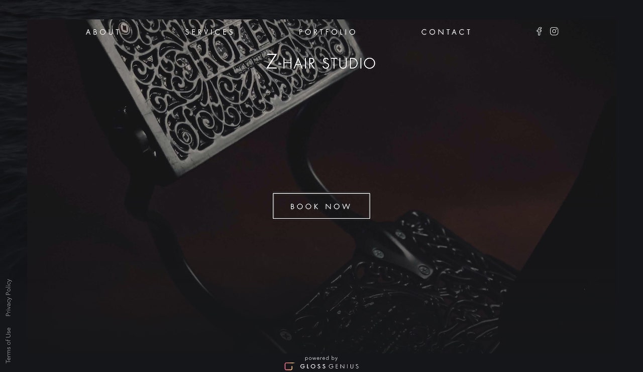
Powered by GlossGenius, Z-Hair Studio's website features a simple black-and-white design with a “Book Now” button placed front and center. When you tap on that button, you'll see a menu of services that includes a consultation; haircut and beard sculpt; men's haircut, shampoo, and style; and special occasion services — all with pricing.
A portfolio link in the main navigation lets the stylists’ work speak for itself. The About page is compelling, with dozens of five-star reviews from happy clients, plus information on salon hours and the cancellation policy.
Key takeaway: The GlossGenius-powered site demonstrates how a clean, minimalist design with a clear booking flow can create a professional presence without overwhelming visitors.
[CTA_MODULE]
3. The Do Cut and Color

Visit The Do Cut and Color’s website, and you'll immediately see an eye-catching homepage slider with a booking button right up top. The user-friendly design gets you wherever you need to be, whether you want to explore the beauty salon's services, view client work, or check out the members of the team.
The salon's phone number, email address, and social links are included on every page, so no matter where you are on the website, you can get in touch.
Design win: The homepage slider creates visual interest and showcases multiple aspects of the salon experience, while keeping the booking button accessible at all times.
4. Albrecht's
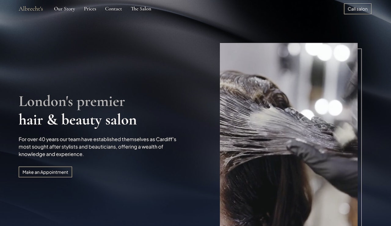
Albrecht's is a family-owned business that's been in operation for 40 years, and the website proudly displays the salon's history. Nostalgic photos from the '80s through the modern day hint at the decades of high-quality hair care.
The site pairs clear booking access with easy-to-find contact details, while the services menu lists offerings and prices. Simple and clear, Albrecht's site makes booking and pricing easy to find—two elements commonly associated with higher conversion rates.
Trust builder: Leveraging your salon's history and heritage builds trust — clients love knowing they're in experienced hands.
5. The Clip Joint Salon

Modern, eclectic, and timeless—those are the three words you see at the top of The Clip Joint's website, and they couldn't be more fitting. Splashes of color paired with simple navigation make the site easy to browse while keeping the focus on booking and services.
The booking button at the top enables quick appointment setting, while the services menu with pricing clearly explains what to expect with each service. One of the most impressive sections of the site is the page featuring stylists. Stunning photography puts a face to the names and showcases the people behind the brand.
Client impact: Investing in professional stylist photography humanizes your brand and helps clients feel connected before they even walk through the door.
6. Ginger & Maude

"We don't just love hair — we love people" is the tagline on Ginger & Maude's website, and the site certainly has a welcoming vibe. The brand focuses on supporting inclusion in a supportive environment where customers, employees, and the community as a whole can gather for all their hair beautifying needs.
The salon has four locations, which they've listed along with a booking button to help clients quickly select their desired salon location, date, and time. As Ginger & Maude is also a franchise, the site includes information on becoming a salon owner and helping to carry on the brand’'s mission and vision.
Best practice: For multi-location salons, a clear location selector paired with consistent branding ensures clients get the same experience no matter which location they visit.
7. Lavish Salon

Lavish Salon's top navigation helps clients move straight to booking, the Lookbook, or the online store. Not your average salon, Lavish Salon focuses on nontoxic hair care and recycling 95% of its waste. It's a luxury experience with an eye toward sustainability, and the site makes the two worlds coexist.
Conversion driver: Page one testimonials and a commitment to green practices.
8. Hårimperiet

The Hårimperiet hair salon website is written in Swedish, but you can also translate the site to English from your browser if you want to read its content. Otherwise, you can simply appreciate the site's design aesthetic.
Bold visuals and a front-and-center booking button encourage people to take action, while stylist profiles and easy navigation of services help you get a feel for the salon's offerings. Another great feature of the site is the map included on the homepage, helping customers find the location with precision.
User benefit: Embedding a map directly on your homepage removes friction for new clients trying to find you — especially important for local businesses.
9. Studio 27 Salon

Visit the STUDIO 27 SALON website, and you'll quickly locate an online booking button to schedule your appointment for a hair trim, shampoo and blow dry, color treatment, braiding or other services.
Clients trust the salon's expert stylists with their precious locks, as the salon specializes in black hair care. Clear top-bar navigation and a simple black-and-white layout keep the site straightforward to navigate.
Positioning: Clearly communicating your niche specialization (like black hair care) helps attract your ideal clients and positions you as an expert in your field.
10. Wise Men Barbers
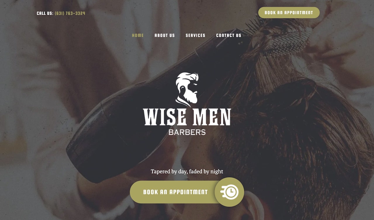
Wise Men Barbers highlights booking on the homepage so users can self-schedule. A clean-looking logo, simple text, and a services menu with pricing allow visitors to see what the business has to offer.
The site invites people with all kinds of hair to book an appointment — making anyone feel prestigious and attractive. If you're a barbershop looking to build a booking website, this is one you should definitely check out.
Brand signal: Inclusive messaging that welcomes "all kinds of hair" broadens your appeal and makes every potential client feel like they belong.
11. Verde Salon
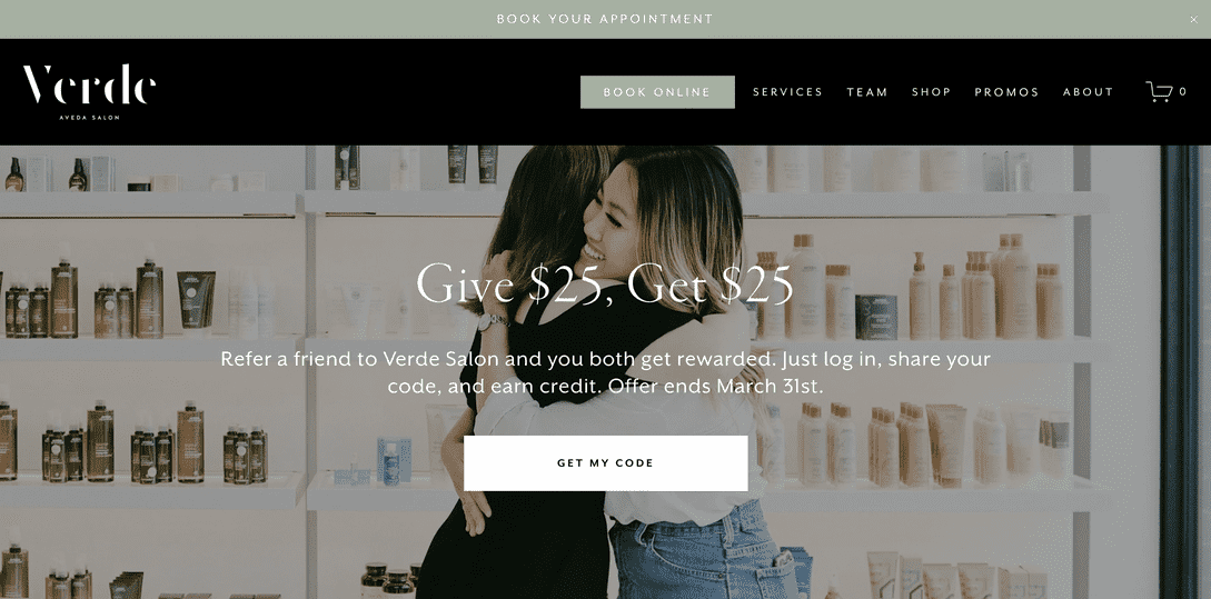
Verde Salon features its current promotions above the fold on its stunning website, with alluring photos and bold text that displays the salon's philosophy. The salon focuses on ethically sourced products and continuing education for its staff, allowing them to exceed guests' expectations.
Scroll through the homepage, and it feels like you're there in the salon, enjoying a full range of hair care services. Clients can book from the top navigation or the main booking button, so they can get in and get loved on by the Verde staff.
Prompt to act: Featuring current promotions above the fold creates urgency and gives visitors an immediate reason to book now rather than later.
[CTA_MODULE]
12. All Dolled Up

The All Dolled Up salon is a beauty and bridal boutique, and the website quickly draws in brides to be along with their bridal parties. When clients want to get beautiful for their special day, they turn to All Dolled Up for all their hair care needs, from cutting and coloring to up-do styles.
The frequently asked questions are a nice touch, touching on common questions like "How much will it cost to lighten my hair?" and "Is it all one set price?" With lots of white space, gorgeous gallery photos, and clearly written content, All Dolled Up is a natural fit for our list of the best hair salon websites.
Friction reducer: A dedicated FAQ section addresses common concerns upfront, reducing booking hesitation and saving you time answering repetitive questions.
13. Love, Dunette
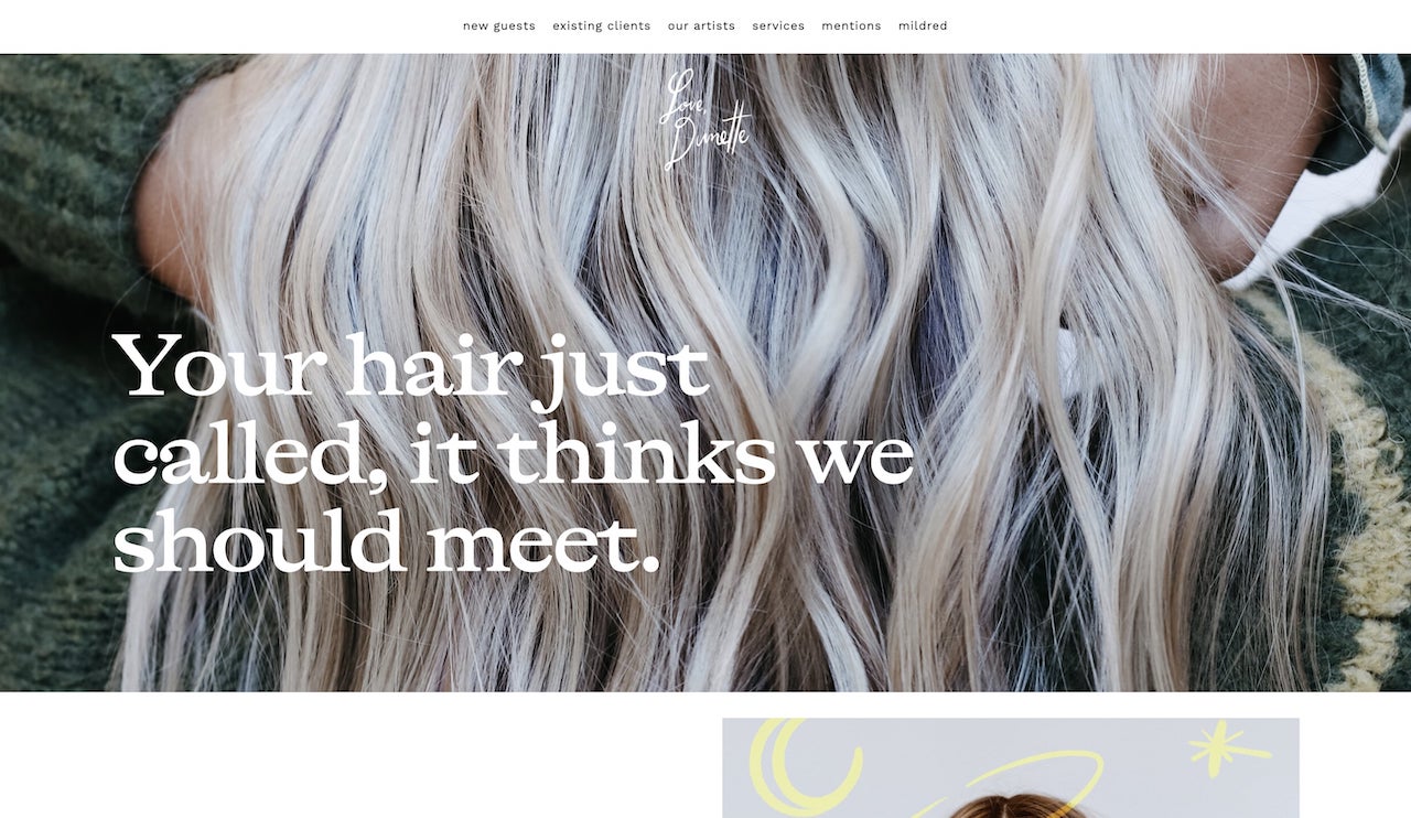
Love, Dunette is another hair salon website with beautiful photography and animations, bold fonts, and clear navigation. Its accessible services menu and top-bar menu help clients move through the site.
The "new guests" page is useful for new clients to get all the details on how to choose a stylist that will work for them, plus dedicated booking buttons beneath each one for streamlined scheduling.
First-visit helper: A dedicated "new guests" page removes the intimidation factor for first-time visitors and guides them through the booking process with confidence.
14. Mèche Salon
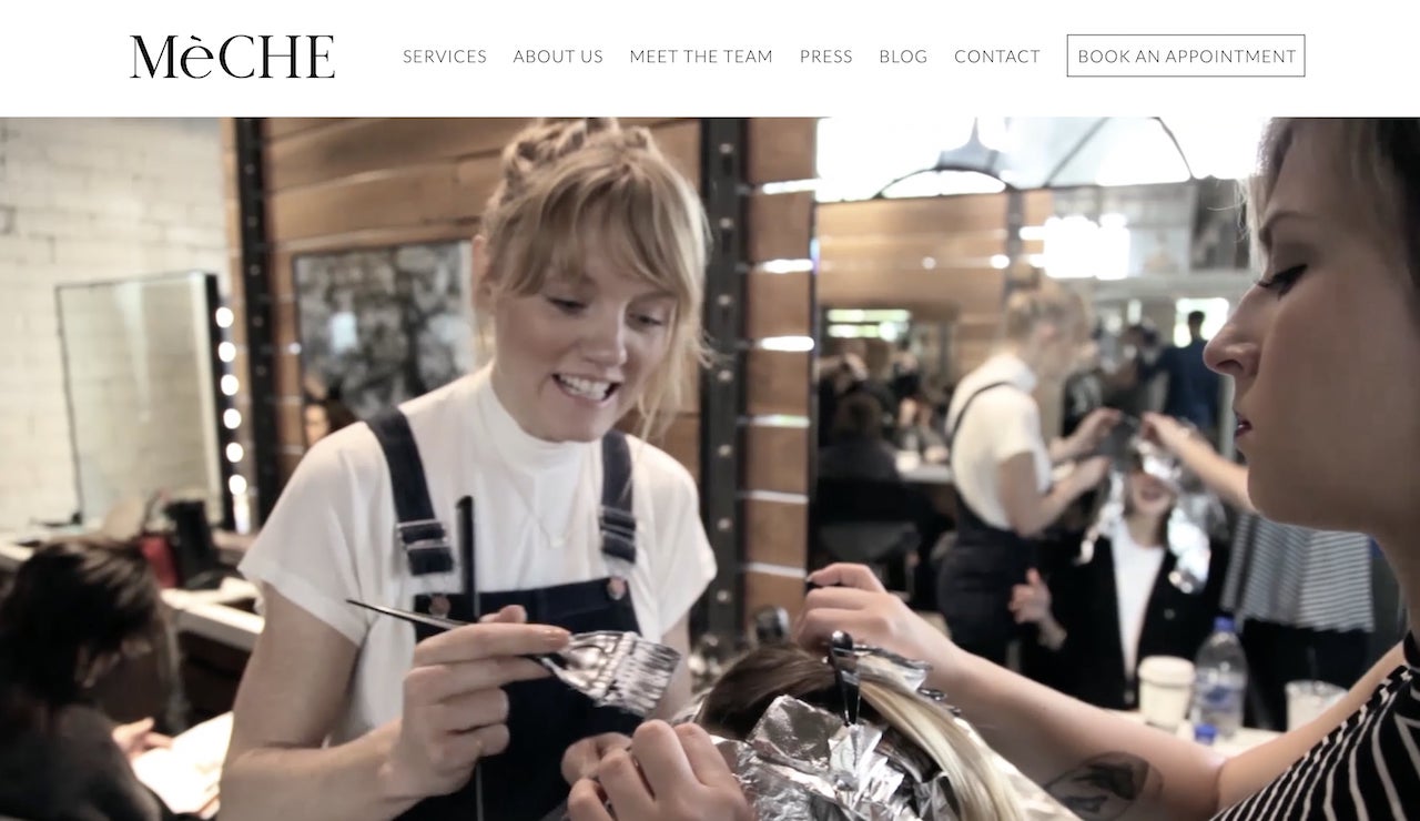
Bold photography, large type, and a booking-first layout make the Mèche Salon site easy to scan and action-oriented. The slider menu of stylists on the homepage also makes it easy for clients to view stylist profiles and choose a staff member to suit their needs.
The site also includes a "Press" tab for visitors to check out their accolades and honorable mentions in publications.
Seamless marketing: Embedded link to salon Instagram plus dedicated Press tab
15. Society
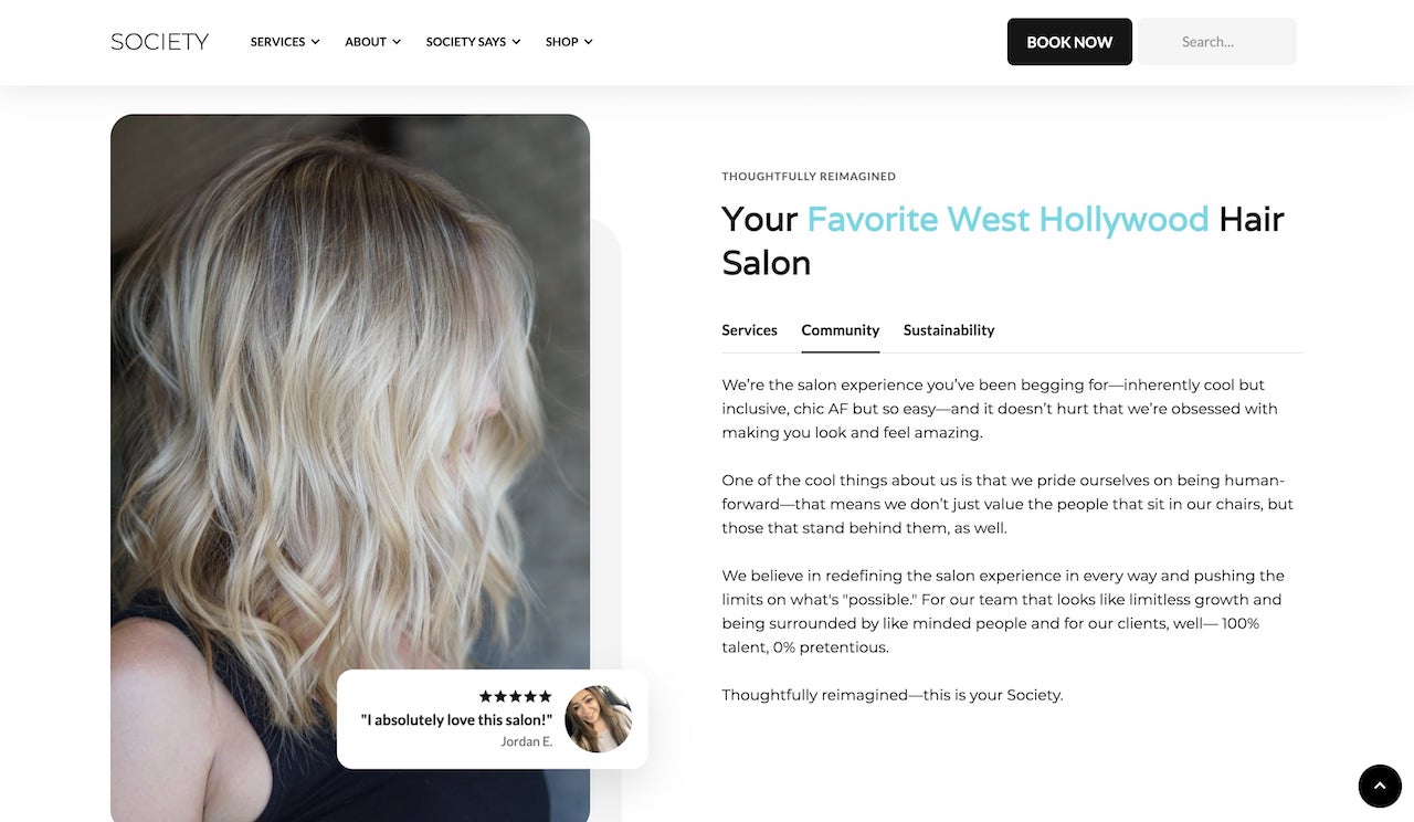
Society features client testimonials front and center, along with a booking button that's accessible from any page on the website. Simple, clean, black-and-white design with pops of photography brings the site to life.
The site also includes a blog with engaging topics like "4 Ways to Ease the Transition to Gray Hair" and "Purple Shampoo: The Secret to Brass-Free Hair." The navigation at both the top and bottom are great ways to streamline the navigation process.
Credibility boost: Placing testimonials prominently on your homepage builds instant trust — social proof is one of the most powerful conversion tools you have.
How to design a hair salon website in 4 steps
You can design a professional hair salon website in four steps: define your brand, create a user-friendly layout, add engaging elements, and choose the right platform. Designing a great hair salon website involves more than just pretty pictures and a catchy tagline. It's about creating a seamless user experience that encourages visitors to book an appointment and return to your site.
Read on for some tips for your hair salon web design.
1. Define your salon's brand and target audience
Your brand is more than just your logo and color scheme; it's the experience you offer. Identify your target audience and tailor your website design to meet their needs.
Are you an upscale, lavish salon and spa that specializes in avant-garde hairstyles for your visitors, or do you cater to a more conservative beauty clientele? Consider your brand voice and the emotions you want to evoke when clients visit your site.
If you can't quite figure out what your beauty brand represents or who your target audience might be, take some time to work through your salon branding before moving forward.
2. Create a user-friendly layout for your salon website
A user-friendly layout helps visitors find what they need as they browse. Use a minimalist approach to avoid clutter and make sure that your homepage provides clear pathways to the most important sections of your site. Design with mobile-first in mind, since most clients will find you on their phones.
Don't clutter things up with complicated, hard-to-read font choices or too many photos. A little bit goes a long way! Showcase the hairstyles your salon and spa offers in a legible font and color palette, and make sure your visitors know how to get in touch with you.
If you want to have more information on your site to further enhance your online presence, you can always link to additional pages or your social media profiles.
3. Add engaging elements
To keep website visitors engaged and boost your online presence, incorporate interactive elements like:
- A carousel showcasing your best work and transformations
- Before-and-after galleries that demonstrate your expertise
- Video tutorials or behind-the-scenes content
- Client testimonials and reviews
- Social media feeds showing your latest work
High-quality, engaging content will make visitors more likely to explore your site and book an appointment.
4. Choose the right platform
Selecting the right website builder is crucial. Platforms like WordPress, Wix, and Squarespace offer various templates and customization options to suit your salon's needs, but GlossGenius also provides customizable, mobile-responsive website templates alongside its all-in-one booking, payments, and client management.
For example, Z-Hair Studio built their entire booking site with GlossGenius, featuring a portfolio, reviews, and seamless scheduling — all without hiring a web designer.
Regardless of the option you choose, you should always make sure that the platform supports features like an online booking system, mobile responsiveness, and social media integration.
Enhance your online presence and reach new clients with GlossGenius
If you're tired of switching between tools—and still chasing down payments and follow-ups—keeping everything in one place matters. GlossGenius combines booking, payments, and marketing in one platform, Starting at $24/month when billed annually.
With GlossGenius’ website builder and intuitive app, creating a trendy, functional beauty salon website has never been easier. This user-friendly tool guarantees that your site is not only visually appealing, but also highly effective in attracting and retaining clients.
But that's not all. GlossGenius offers a suite of powerful features beyond website building. You can use our online booking tool to simplify appointment scheduling for your clients, or boost your salon’s visibility and attract new customers with our integrated marketing tools. And don’t forget about our embedded features for client notifications, so you can keep your clients informed with automated reminders and updates.
With the help of GlossGenius, you can increase bookings, improve the client experience, and take your hair salon business to new levels. Start your free 14-day trial with GlossGenius today and see how our comprehensive platform can transform your salon.
This information is provided for general educational purposes only. For legal, cybersecurity or compliance advice specific to your business or situation, please consult a professional.
All prices and feature comparisons are as of March 2026. GlossGenius has no affiliation, sponsorship, or endorsement with the other companies mentioned in this article or their affiliates. All trademarks, logos, and brand names are used for identification purposes only and remain the property of their respective owners.
.png)
.png)
Join Our Genius Newsletter
Get the latest articles, inspiring how-to’s, and educational workbooks delivered to your inbox.
15 Hair Salon Website Design Examples for Inspiration
Your website is often the first impression potential clients have of your salon, and the right design can turn browsers into booked appointments. These 15 hair salon website design examples showcase what works in 2026: prominent booking buttons, stunning photography, mobile-friendly layouts, and clear service menus that make scheduling effortless. Whether you're building from scratch or refreshing an existing site, you'll find actionable inspiration to create a website that reflects your brand and keeps your chairs full.


Key takeaways
- The best hair salon websites combine stunning visuals, easy navigation, and seamless online booking to convert visitors into clients
- Mobile responsiveness is non-negotiable — most clients search for salons on their phones, and a clunky mobile experience means lost bookings
- A prominent booking button and clear service menu with pricing are the two highest-converting elements on any salon website
- You can build a professional salon website in minutes with the right platform — no design experience required
As a hair salon owner, you have a lot on your plate. Maybe you're just getting started, you have a tiny budget, and you're super busy — so building a website might seem less important compared to the day-to-day operations of your business. However, hair salon websites are a critical component of getting people through your doors and into your salon chairs.
Try GlossGenius free for 14 days!
Having one makes you appear more professional, helps you attract local business, and gives you a chance to showcase your best work. Plus, today's technologies have made it easier than ever to build a website in a matter of minutes, without hiring a costly web design agency.
To help inspire you to create a website of your own, we've put together our picks for the 15 best hair salon website design examples from around the web. But first, let's talk about what makes a great hair salon website.
What makes a great hair salon website?
A great hair salon website combines stunning visuals, intuitive navigation, and seamless online booking to convert visitors into clients. Your website should be beautiful, straightforward to navigate, and built for conversions — so you can get more people to book appointments and return in the future.
If your calendar isn't as full as it should be, your website and booking experience may be costing you appointments. On average, businesses on GlossGenius saw a 22% increase in appointments within their first year on GlossGenius.
The essentials of effective salon website design include the following:
User-friendly navigation
Potential clients should be able to quickly view testimonials, past work, and service pricing. If someone hasn't been to your salon before and found you through a local search, they'll want to know what kind of results to expect and how much it will cost.
Consider it from the perspective of the client. You want to find the information you need as quickly as possible, without getting lost in the process. The navigation should be simple.
You should always have a clear navigation bar with a booking link at the top of every page on your site, or at least have links to it clearly displayed somewhere on each page. If your clients can't find their way around easily, they'll quickly become frustrated and leave your website in favor of one that's easier to use.
Mobile responsiveness
When potential clients can't easily browse your services on their phone, they bounce—and you lose bookings. That's why your site needs to be mobile responsive, and with GlossGenius you can also create a mobile app for your salon that puts the power of your website in clients' hands.
Seamless online booking
Clients should be able to book directly on your site without needing to call. With booking software for beauty, wellness, and health businesses like GlossGenius, hair salon owners can quickly integrate appointment scheduling into their websites. GlossGenius is designed for fast booking—many clients can complete booking in under 30 seconds, without logins or app downloads.
High-quality photography and visuals
Hair salon and other beauty, wellness, and health business websites should always have high-quality photos that show off the team and products in action. You want to be sure that anyone who visits your website can see the quality of your stylists' work and the overall vibe of your salon.
Consider adding a portfolio gallery to showcase your best transformations. If they like what they see, they'll book an appointment!
Strategic color palette and branding
A well-chosen color palette can set the tone for your beauty salon and reflect the style and ambiance of your physical space. Whether you opt for a minimalist black and white scheme or a lavish salon-inspired blend of golds and creams, your color choices and background should align with your brand and appeal to your target audience.
What to look for in salon website examples
Before diving into our curated list of hair salon website examples, it helps to know what you're looking for. Use this checklist as you review each example to identify design elements you might want to incorporate into your own site:
- Booking button placement: Is it visible above the fold? Can you find it from every page?
- Service menu clarity: Are services listed with descriptions and pricing?
- Visual quality: Do the photos showcase the salon's best work and atmosphere?
- Mobile experience: Would this site be easy to navigate on a phone?
- Brand consistency: Do the colors, fonts, and imagery tell a cohesive story?
- Social proof: Are there testimonials, reviews, or before-and-after galleries?
- Contact information: Is it easy to find the salon's location, hours, and phone number?
Keep these elements in mind as you explore the examples below — and note which features resonate with your own brand vision.
15 best hair salon website examples for design inspiration
The best hair salon websites share common traits: booking-first CTAs, strong photography, and mobile-friendly designs that make booking effortless. Our selected salon website examples are below:
1. thp hair

The neutral tones and simple aesthetic of thp hair's website draw people in and encourage them to keep scrolling. A simple menu at the top includes information on services, details about the salon, and contact information. Meanwhile, a booking link takes website visitors to an appointment scheduling page where they can select their desired service, hair stylist, and date.
The site also pulls in images from the salon's social media and Instagram page, where people can see more examples of stylists' work. The site includes a call to action to join the mailing list, helping the salon continue their marketing efforts beyond the website.
What stands out: The neutral color palette creates a sophisticated, calming vibe that lets the photography shine — proving that sometimes less really is more.
2. Z-Hair Studio

Powered by GlossGenius, Z-Hair Studio's website features a simple black-and-white design with a “Book Now” button placed front and center. When you tap on that button, you'll see a menu of services that includes a consultation; haircut and beard sculpt; men's haircut, shampoo, and style; and special occasion services — all with pricing.
A portfolio link in the main navigation lets the stylists’ work speak for itself. The About page is compelling, with dozens of five-star reviews from happy clients, plus information on salon hours and the cancellation policy.
Key takeaway: The GlossGenius-powered site demonstrates how a clean, minimalist design with a clear booking flow can create a professional presence without overwhelming visitors.
[CTA_MODULE]
3. The Do Cut and Color

Visit The Do Cut and Color’s website, and you'll immediately see an eye-catching homepage slider with a booking button right up top. The user-friendly design gets you wherever you need to be, whether you want to explore the beauty salon's services, view client work, or check out the members of the team.
The salon's phone number, email address, and social links are included on every page, so no matter where you are on the website, you can get in touch.
Design win: The homepage slider creates visual interest and showcases multiple aspects of the salon experience, while keeping the booking button accessible at all times.
4. Albrecht's

Albrecht's is a family-owned business that's been in operation for 40 years, and the website proudly displays the salon's history. Nostalgic photos from the '80s through the modern day hint at the decades of high-quality hair care.
The site pairs clear booking access with easy-to-find contact details, while the services menu lists offerings and prices. Simple and clear, Albrecht's site makes booking and pricing easy to find—two elements commonly associated with higher conversion rates.
Trust builder: Leveraging your salon's history and heritage builds trust — clients love knowing they're in experienced hands.
5. The Clip Joint Salon

Modern, eclectic, and timeless—those are the three words you see at the top of The Clip Joint's website, and they couldn't be more fitting. Splashes of color paired with simple navigation make the site easy to browse while keeping the focus on booking and services.
The booking button at the top enables quick appointment setting, while the services menu with pricing clearly explains what to expect with each service. One of the most impressive sections of the site is the page featuring stylists. Stunning photography puts a face to the names and showcases the people behind the brand.
Client impact: Investing in professional stylist photography humanizes your brand and helps clients feel connected before they even walk through the door.
6. Ginger & Maude

"We don't just love hair — we love people" is the tagline on Ginger & Maude's website, and the site certainly has a welcoming vibe. The brand focuses on supporting inclusion in a supportive environment where customers, employees, and the community as a whole can gather for all their hair beautifying needs.
The salon has four locations, which they've listed along with a booking button to help clients quickly select their desired salon location, date, and time. As Ginger & Maude is also a franchise, the site includes information on becoming a salon owner and helping to carry on the brand’'s mission and vision.
Best practice: For multi-location salons, a clear location selector paired with consistent branding ensures clients get the same experience no matter which location they visit.
7. Lavish Salon

Lavish Salon's top navigation helps clients move straight to booking, the Lookbook, or the online store. Not your average salon, Lavish Salon focuses on nontoxic hair care and recycling 95% of its waste. It's a luxury experience with an eye toward sustainability, and the site makes the two worlds coexist.
Conversion driver: Page one testimonials and a commitment to green practices.
8. Hårimperiet

The Hårimperiet hair salon website is written in Swedish, but you can also translate the site to English from your browser if you want to read its content. Otherwise, you can simply appreciate the site's design aesthetic.
Bold visuals and a front-and-center booking button encourage people to take action, while stylist profiles and easy navigation of services help you get a feel for the salon's offerings. Another great feature of the site is the map included on the homepage, helping customers find the location with precision.
User benefit: Embedding a map directly on your homepage removes friction for new clients trying to find you — especially important for local businesses.
9. Studio 27 Salon

Visit the STUDIO 27 SALON website, and you'll quickly locate an online booking button to schedule your appointment for a hair trim, shampoo and blow dry, color treatment, braiding or other services.
Clients trust the salon's expert stylists with their precious locks, as the salon specializes in black hair care. Clear top-bar navigation and a simple black-and-white layout keep the site straightforward to navigate.
Positioning: Clearly communicating your niche specialization (like black hair care) helps attract your ideal clients and positions you as an expert in your field.
10. Wise Men Barbers

Wise Men Barbers highlights booking on the homepage so users can self-schedule. A clean-looking logo, simple text, and a services menu with pricing allow visitors to see what the business has to offer.
The site invites people with all kinds of hair to book an appointment — making anyone feel prestigious and attractive. If you're a barbershop looking to build a booking website, this is one you should definitely check out.
Brand signal: Inclusive messaging that welcomes "all kinds of hair" broadens your appeal and makes every potential client feel like they belong.
11. Verde Salon

Verde Salon features its current promotions above the fold on its stunning website, with alluring photos and bold text that displays the salon's philosophy. The salon focuses on ethically sourced products and continuing education for its staff, allowing them to exceed guests' expectations.
Scroll through the homepage, and it feels like you're there in the salon, enjoying a full range of hair care services. Clients can book from the top navigation or the main booking button, so they can get in and get loved on by the Verde staff.
Prompt to act: Featuring current promotions above the fold creates urgency and gives visitors an immediate reason to book now rather than later.
[CTA_MODULE]
12. All Dolled Up

The All Dolled Up salon is a beauty and bridal boutique, and the website quickly draws in brides to be along with their bridal parties. When clients want to get beautiful for their special day, they turn to All Dolled Up for all their hair care needs, from cutting and coloring to up-do styles.
The frequently asked questions are a nice touch, touching on common questions like "How much will it cost to lighten my hair?" and "Is it all one set price?" With lots of white space, gorgeous gallery photos, and clearly written content, All Dolled Up is a natural fit for our list of the best hair salon websites.
Friction reducer: A dedicated FAQ section addresses common concerns upfront, reducing booking hesitation and saving you time answering repetitive questions.
13. Love, Dunette

Love, Dunette is another hair salon website with beautiful photography and animations, bold fonts, and clear navigation. Its accessible services menu and top-bar menu help clients move through the site.
The "new guests" page is useful for new clients to get all the details on how to choose a stylist that will work for them, plus dedicated booking buttons beneath each one for streamlined scheduling.
First-visit helper: A dedicated "new guests" page removes the intimidation factor for first-time visitors and guides them through the booking process with confidence.
14. Mèche Salon

Bold photography, large type, and a booking-first layout make the Mèche Salon site easy to scan and action-oriented. The slider menu of stylists on the homepage also makes it easy for clients to view stylist profiles and choose a staff member to suit their needs.
The site also includes a "Press" tab for visitors to check out their accolades and honorable mentions in publications.
Seamless marketing: Embedded link to salon Instagram plus dedicated Press tab
15. Society

Society features client testimonials front and center, along with a booking button that's accessible from any page on the website. Simple, clean, black-and-white design with pops of photography brings the site to life.
The site also includes a blog with engaging topics like "4 Ways to Ease the Transition to Gray Hair" and "Purple Shampoo: The Secret to Brass-Free Hair." The navigation at both the top and bottom are great ways to streamline the navigation process.
Credibility boost: Placing testimonials prominently on your homepage builds instant trust — social proof is one of the most powerful conversion tools you have.
How to design a hair salon website in 4 steps
You can design a professional hair salon website in four steps: define your brand, create a user-friendly layout, add engaging elements, and choose the right platform. Designing a great hair salon website involves more than just pretty pictures and a catchy tagline. It's about creating a seamless user experience that encourages visitors to book an appointment and return to your site.
Read on for some tips for your hair salon web design.
1. Define your salon's brand and target audience
Your brand is more than just your logo and color scheme; it's the experience you offer. Identify your target audience and tailor your website design to meet their needs.
Are you an upscale, lavish salon and spa that specializes in avant-garde hairstyles for your visitors, or do you cater to a more conservative beauty clientele? Consider your brand voice and the emotions you want to evoke when clients visit your site.
If you can't quite figure out what your beauty brand represents or who your target audience might be, take some time to work through your salon branding before moving forward.
2. Create a user-friendly layout for your salon website
A user-friendly layout helps visitors find what they need as they browse. Use a minimalist approach to avoid clutter and make sure that your homepage provides clear pathways to the most important sections of your site. Design with mobile-first in mind, since most clients will find you on their phones.
Don't clutter things up with complicated, hard-to-read font choices or too many photos. A little bit goes a long way! Showcase the hairstyles your salon and spa offers in a legible font and color palette, and make sure your visitors know how to get in touch with you.
If you want to have more information on your site to further enhance your online presence, you can always link to additional pages or your social media profiles.
3. Add engaging elements
To keep website visitors engaged and boost your online presence, incorporate interactive elements like:
- A carousel showcasing your best work and transformations
- Before-and-after galleries that demonstrate your expertise
- Video tutorials or behind-the-scenes content
- Client testimonials and reviews
- Social media feeds showing your latest work
High-quality, engaging content will make visitors more likely to explore your site and book an appointment.
4. Choose the right platform
Selecting the right website builder is crucial. Platforms like WordPress, Wix, and Squarespace offer various templates and customization options to suit your salon's needs, but GlossGenius also provides customizable, mobile-responsive website templates alongside its all-in-one booking, payments, and client management.
For example, Z-Hair Studio built their entire booking site with GlossGenius, featuring a portfolio, reviews, and seamless scheduling — all without hiring a web designer.
Regardless of the option you choose, you should always make sure that the platform supports features like an online booking system, mobile responsiveness, and social media integration.
Enhance your online presence and reach new clients with GlossGenius
If you're tired of switching between tools—and still chasing down payments and follow-ups—keeping everything in one place matters. GlossGenius combines booking, payments, and marketing in one platform, Starting at $24/month when billed annually.
With GlossGenius’ website builder and intuitive app, creating a trendy, functional beauty salon website has never been easier. This user-friendly tool guarantees that your site is not only visually appealing, but also highly effective in attracting and retaining clients.
But that's not all. GlossGenius offers a suite of powerful features beyond website building. You can use our online booking tool to simplify appointment scheduling for your clients, or boost your salon’s visibility and attract new customers with our integrated marketing tools. And don’t forget about our embedded features for client notifications, so you can keep your clients informed with automated reminders and updates.
With the help of GlossGenius, you can increase bookings, improve the client experience, and take your hair salon business to new levels. Start your free 14-day trial with GlossGenius today and see how our comprehensive platform can transform your salon.
This information is provided for general educational purposes only. For legal, cybersecurity or compliance advice specific to your business or situation, please consult a professional.
All prices and feature comparisons are as of March 2026. GlossGenius has no affiliation, sponsorship, or endorsement with the other companies mentioned in this article or their affiliates. All trademarks, logos, and brand names are used for identification purposes only and remain the property of their respective owners.
Download Now
.png)
.png)
Join Our Genius Newsletter
Get the latest articles, inspiring how-to’s, and educational workbooks delivered to your inbox.


