Building Your Brand: FadedByDiana
Here’s why we LOVE Diana’s personal booking site

A beautifully designed personal booking website goes a long way. It’s one of the first impressions that potential clients have of you. That’s why we designed an elegant, professional booking site to help you impress clients. Professionals customize their site with creative content like a background picture, photos of their work, a personal bio, info about their business, etc.
We’ve seen so many STUNNING booking sites that GlossGenius professionals have created to step up their business brand and we’re featuring them so we can share them with you. Click through them, use them for inspiration, and let us know if you see any other personal sites that you’d like us to feature!
Try GlossGenius free for 14 days!
Our Personal Site of this Week is Diana’s.
About Diana: Diana is a #GlossBoss located in Sioux Falls, South Dakota. She specializes in men’s grooming, offering haircuts, beard trims, grey blending, and waxing services. Recently, she’s also begun providing women's services as well, including: haircuts, highlights/lowlights, colors, styles, and waxing.
Here’s why we LOVE Diana’s personal booking site:
[CTA_MODULE]
Classic, On-Brand Front Page Photo

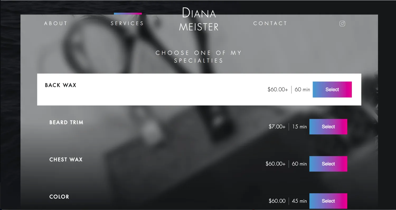
It’s relevant. The focus of the photo, the scissors – conveys what Diana’s expertise is as a hair stylist.
It suits her audience. The greyscale photo creates a classic, neutral vibe that fits her predominantly male customer base.
Simple Services.

Diana maintains a minimalist vibe to her website by providing no description or photos of her services. Although this does not work if services are hard for people to understand (e.g. balayage), the way that Diana names her services very simply enables her to do this.
Try GlossGenius free for 14 days!
Consistent Black and White Tone

Diana keeps a similar black and white, minimalist tone on her social media services like Instagram. The faded grayscale tone also cleverly alludes to her business name: “FadedByDiana.”
On the top right of her website, she also links clients to her Instagram page. This makes it easy for clients to find pictures of Diana’s services, even if she has chosen not to display photos with her services on her website to keep a minimalist tone.
Keep your eyes out for our next feature and start thinking -- what will your business brand look like? DM us on Instagram @glossgenius if you want to share any cool personal booking sites on GlossGenius that you’ve seen as well!
Want to set up a personal booking site like Diana’s? Sign up for your free 14-day trial of GlossGenius here!
[CTA_MODULE]
.png)
.png)
Join Our Genius Newsletter
Get the latest articles, inspiring how-to’s, and educational workbooks delivered to your inbox.
Building Your Brand: FadedByDiana


A beautifully designed personal booking website goes a long way. It’s one of the first impressions that potential clients have of you. That’s why we designed an elegant, professional booking site to help you impress clients. Professionals customize their site with creative content like a background picture, photos of their work, a personal bio, info about their business, etc.
We’ve seen so many STUNNING booking sites that GlossGenius professionals have created to step up their business brand and we’re featuring them so we can share them with you. Click through them, use them for inspiration, and let us know if you see any other personal sites that you’d like us to feature!
Try GlossGenius free for 14 days!
Our Personal Site of this Week is Diana’s.
About Diana: Diana is a #GlossBoss located in Sioux Falls, South Dakota. She specializes in men’s grooming, offering haircuts, beard trims, grey blending, and waxing services. Recently, she’s also begun providing women's services as well, including: haircuts, highlights/lowlights, colors, styles, and waxing.
Here’s why we LOVE Diana’s personal booking site:
[CTA_MODULE]
Classic, On-Brand Front Page Photo

It’s relevant. The focus of the photo, the scissors – conveys what Diana’s expertise is as a hair stylist.
It suits her audience. The greyscale photo creates a classic, neutral vibe that fits her predominantly male customer base.
Simple Services.

Diana maintains a minimalist vibe to her website by providing no description or photos of her services. Although this does not work if services are hard for people to understand (e.g. balayage), the way that Diana names her services very simply enables her to do this.
Try GlossGenius free for 14 days!
Consistent Black and White Tone

Diana keeps a similar black and white, minimalist tone on her social media services like Instagram. The faded grayscale tone also cleverly alludes to her business name: “FadedByDiana.”
On the top right of her website, she also links clients to her Instagram page. This makes it easy for clients to find pictures of Diana’s services, even if she has chosen not to display photos with her services on her website to keep a minimalist tone.
Keep your eyes out for our next feature and start thinking -- what will your business brand look like? DM us on Instagram @glossgenius if you want to share any cool personal booking sites on GlossGenius that you’ve seen as well!
Want to set up a personal booking site like Diana’s? Sign up for your free 14-day trial of GlossGenius here!
[CTA_MODULE]
Download Now
.png)
.png)
Join Our Genius Newsletter
Get the latest articles, inspiring how-to’s, and educational workbooks delivered to your inbox.


